S
J
S

Coral Bay Travel

Coral Bay Travel
Brand Itentity

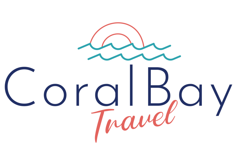
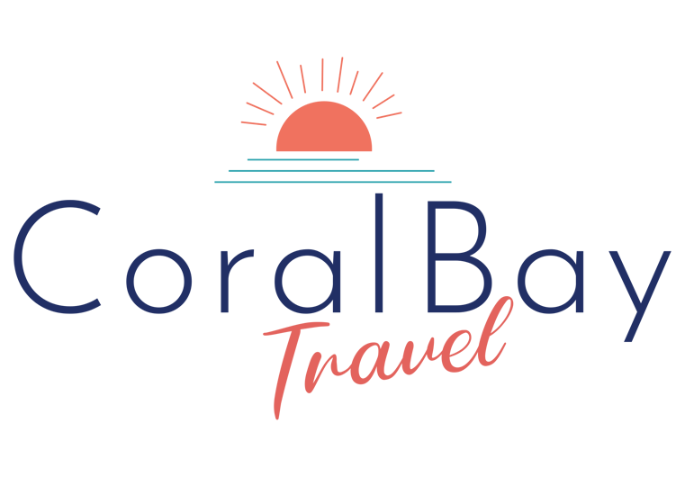
Coral Bay Travel approached me to design a logo for their new travel business, which offers all-inclusive beach holidays in Mauritius. The goal was to create a sophisticated, modern, and breezy logo that would appeal to a South African audience and work across multiple platforms and media.

We iterated through several options, working with a palette of turquoise, coral, and white while testing different typography and layouts. The client chose two primary layouts: a horizontal version with the type beneath the sun icon, and a compact square version with “Travel” stacked under “Coral Bay.” 

Having both layouts gives Coral Bay the flexibility to use the logo on social profiles, advertising, invoices, and other brand touch points.

Deliverables included the final horizontal and square logos, alternate colour variations, and supporting brand assets such as a business card, letterhead, and email signature. All files were supplied in editable source formats so the client can adapt the identity as needed. The finished identity achieved the goal by creating a relaxed yet premium brand, using colour and form to evoke a tropical, beachside experience.
Logo Iterations
Option 1
Option 2
Option 3
Final Design
Variations of Final Logo

Silvia Miles Rebounding

Silvia Miles Rebounding
Logo Design

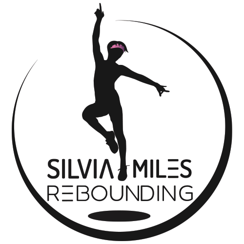
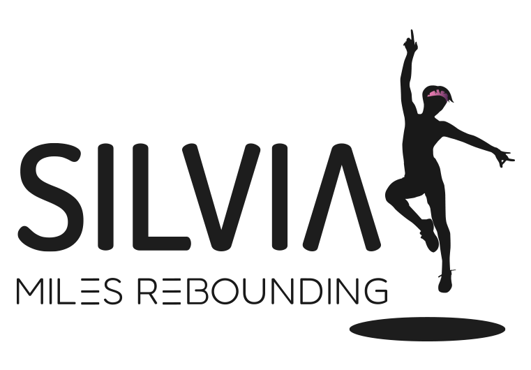
Silvia Miles approached me to design a logo for her new Rebounding website, where she offers both online and in-person classes. The goal was to create a minimalistic, vibrant logo that aligned with her brand colours. Silvia provided some logo examples and photos that would be used on her website, which guided the design process.  I traced a photo to create a silhouette of Silvia jumping on a rebounder, which became the icon in her logo and captured the dynamic energy of her classes. 

The black stylized font and black icon contributed to a minimalist and modern look, while a subtle pop of colour added to the headband enhanced the vibrancy of the design. After completing the logo, I also created an animated version for use in her workout video intros. This project was particularly rewarding, as Silvia’s insights were crucial to the final design.

Logo Iterations
Option 1
Option 2
Option 3
Final Design
Variations of Final Logo

I created a few logo variations to meet Silvia’s needs for the logo to be used on various advertising across different platforms. The horizontal logo has the icon on the right with the text to the left, creating a balanced and clean look. The vertical logo has the text below the icon with the design enclosed in a circle, giving it a more compact and cohesive feel, ideal for smaller spaces or branded merchandise. I also provided different colour variations, including black, white, and pink version. These variations allow Silvia to use the suitable logo version for various advertising formats and applications.

Fluxolio

Fluxolio
Brand Identity

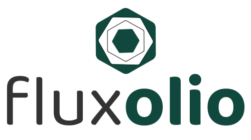
Fluxolio is a project that my partner and I started to offer services and products aimed at improving daily lives through meaningful and productive apps. Although we haven’t officially launched, the brand is designed to house a variety of applications. I created logos and icons for each app, ensuring consistency in design while differentiating them through unique colours and icons. The main icon for Fluxolio was developed by layering and refining various shapes until we landed on a design that resonated with both of us.

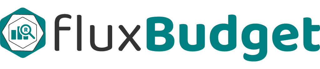
Each application within Fluxolio has its own dedicated colour, which is reflected in both the logo and the overall app design. For instance, the primary “Flux” logo uses a consistent grey, while “Budget” features a light teal that will be carried throughout its app interface. This project marks the beginning of an exciting journey that we are eager to continue.

Brand Logos
Variations of Main Brand Logo

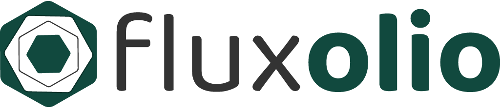
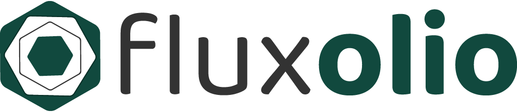
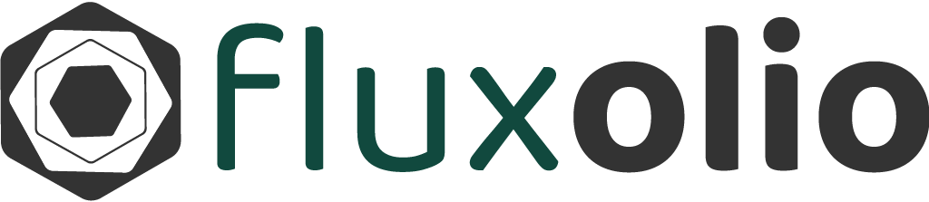
To ensure that the Fluxolio branding remains versatile and professional across all platforms, I developed several variations of the final logo. These included simplified icons and different colour schemes tailored to the specific apps within the brand. I also created various sizes to ensure seamless integration within the app interfaces. The goal was to make the logos adaptable while maintaining a cohesive brand identity across the different applications. These variations allow for easy implementation across multiple devices and screen sizes, ensuring that each app within the Fluxolio suite retains a consistent and polished appearance.

Full-Colour Horizontal Logo
Inverse Horizontal Logo
Monochrome Logo
Monochrome Logo
Previous
Next